
 |
| Add caption |
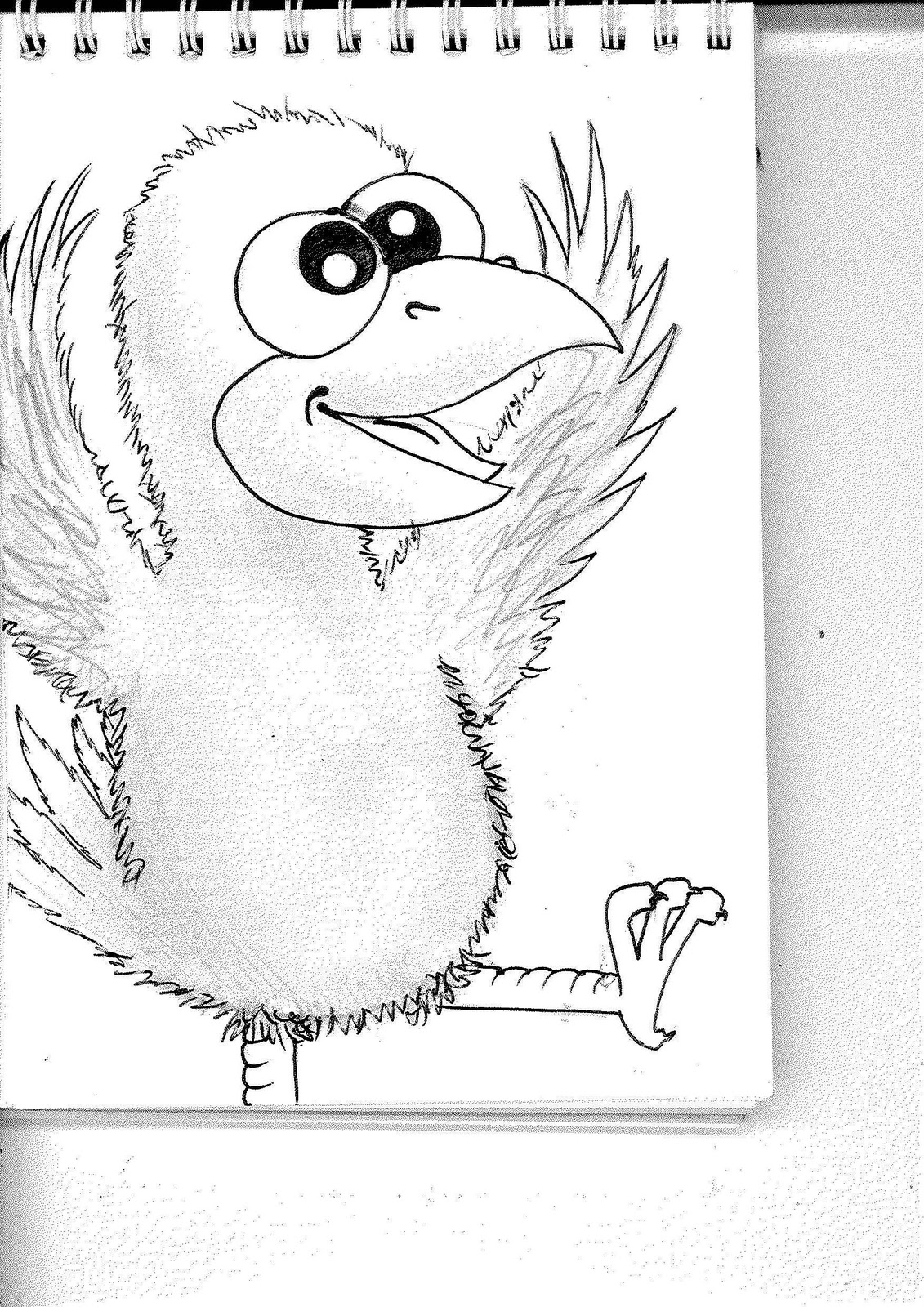
'The Funky Chicken'
Here is my picture that I created for the Illustration Friday brief. We had a group critique and my class suggested that I make the image larger and have it in my actual sketchbook. There was a little difference in opinion when it came to the colour of my chicken, some said it would benefit from colour while others preferred it just shaded.
I took a similar approach as last weeks theme, but used fineliner pen instead of a biro and used a pencil and rubber to make the dust mark on the surface behind 'Janet'. I really enjoy working in this way, it's simple yet effective for me.
The 'Fist in the Air' has always been a significant symbol of power and strong will. Eg. 'Black power' and 'Power to the people'. It's ironic for such a powerful symbol to be bearing the white flag of surrender.
I was advised to use a different media other than pencil, I don't usually use colour and so I thought, seeing as though my past two illustrations were suggested to be in colour, I'd use a form that I'm most comfortable with. Next week I shall use watercolour and see how that goes.
My idea here was that, even though the cat is looking at itself, it's scared and defensive. It could make you realise that sometimes other people will see you in a different way if you do too. I didn't really know how to use water colours to the best of their ability and just guessed with what I had learned in school. I was advised to use water colour paper instead of my sketchbook which would stop the paper from becoming clumpy and flaking away. I also need to make the floor more apparent. |
| 'Dusty' |
 |
| 'The Powerful Fist of... Surrender?' |
The 'Fist in the Air' has always been a significant symbol of power and strong will. Eg. 'Black power' and 'Power to the people'. It's ironic for such a powerful symbol to be bearing the white flag of surrender.
I was advised to use a different media other than pencil, I don't usually use colour and so I thought, seeing as though my past two illustrations were suggested to be in colour, I'd use a form that I'm most comfortable with. Next week I shall use watercolour and see how that goes.
 |
| Reverse Image of a Cat |


Here are my drawings in response to the theme 'Sweater'. They are simple designs of the same sweater, one in charcoal, the other in charcoal and pastel. I was advised to research an artist called Christian Lacriox who specialises in fashion design.
After looking at his work, I realise I need to improve by a lot. Although some of his work doesn't take into consideration the shapes of the human body, he does take into consideration the proportions and I have lost that in my work. Here is an example of his art.


In Photoshop, with the help of a friend, I created a stamp/brush in the form of a butterfly I downloaded from Google. I then placed it in serveral places in various sizes over the page. After printing said page, I used biro and pencil to draw into it. Drawing butterflies, bees and dragonflies in various sizes. I then found the correct letters from various magazines and placed them on top of the 'swarm' of insects.

I did this in pencil and went over it in graphics pen, colouring it in coloured pencils. I then took it onto photoshop and edited the brightness and contrast and added text. I made a mistake with the teddy bear, it should have carried on like 'penny's' legs but it stops at the rail track. When it was shown in a class critique, my peers had said that the media wasn't well chosen. They also disliked how I had used a traditional method and then put it into the computer to add my text.

Sketching out the shape in pencil, i then went over and defined the lines in a black Biro pen. I then tore letters out of a alternative fashion and tattoo magazine. I wanted it to look like a punk poster with the ransom-note looking text and the scribbled picture.


I was told that the idea fits the brief well, but the picture doesn't put that idea across well enough.
